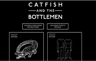
Here is the website bringing all brand elements together


logo
As an Independent/Rock band, the logo is constructed very boldly but simply. For example, the black and white gives a precise look as well as the mono-tone colour scheme remaining low key like the genre. The simplicity shares the stereotypical design of the desired genre, engaging those who are interested as they can cohere the type of music instantly. Ever since major success in 2013, the logo has remained the same so they are fondly remembered by audiences when seeing their new music of previous success. This becomes an element of the brand, as audiences develop a image of the band. The regular and emboldened font give little away, adding mystery, while the band name itself is largely viewed a uncommon which means it may hold the attention of listeners
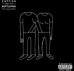
album covers
Some Artists may look to change their album design to show versatility or suggest the slightly different style-making audiences buy. However, Catfish have remained consistent to their first Platinum achieving album. This may be to associate the new album with its previous, hoping the same success continues. In addition, those fans who have the old album and enjoyed it are likely to see the similarity in style and possibly purchase. The same style runs through the logo and album, clarify the bands brand identity and connoting their importance of music.
fashion
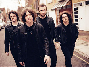
All members of the band are styled in traditional rock style. While on stage, predominately black is worn, with items such as leather jackets are sported to suggest a rebellious side. Due to the fans of rock often critical of a bands image, by dressing in a casual and non-flamboyant way it is safe and low key to support the genre. The haircuts of the band are also what are expected, with long hair, showing a more retro style of when the genre was at its peak. This implies to the audience their traditional music type in a day of newer pop music.
"I feel like everybody started thinking too outside the box trying to be arty and different. We wanted to stay inside the box."
Front man of the Band, McCann, has stated his beliefs in the quote above taken from an NME interview. This shows why the band has developed a traditional brand identity, stating they prefer a more conventional music genre. While making comments like this, the designs of the album/logo make more sense, being more low key to create a brand.

public image
Like the fashion of the band, the right image is needed for the specific genres. They have caused controversy in the past by throwing guitars on stage-a lack of care for the cost- to build a reputation through rock and roll antics. By committing such acts, they attract wider audiences as their unpredictably is a spectacle for many. As an audience member myself, I can confirm that they are rightly known for their live performances and fan following as they put on a real show.
social media

With a target demographic of 16-30 year olds, social networking is a key tool due to the popularity of the platform in this age range. The band 'like' fan tweets to build relations with audience members. Furthermore, by liking these tweets it encourage more public praise as fans want to be recognised by their idols. This sharing of music can work to promote new albums and other projects in their favour.